
Are The Inflation Kernels Starting To Pop?
On Friday, I wrote about the outlook for housing inflation, which is a big part of the overall (and especially core) CPI. If you missed that piece, you can find it here. As a quick update: today, the FHFA House Price Index was reported +1.5% for August, versus expectations for +0.7%, and the S&P CoreLogic neé Case-Shiller 20-City Home Price Index was reported at +5.18% y/y versus expectations for +4.20%. So, as I noted in that piece – the signs for home prices remain very supportive, and that suggests that rents are unlikely to continue to decelerate for very long.
I focused first on housing because that is the largest and most-ponderous category of the Consumer Price Index. Today I want to turn more broadly and look at everything else, collectively. Because I think there are some reasons to think that not just housing, but the inflation process itself, is starting to look more buoyant.
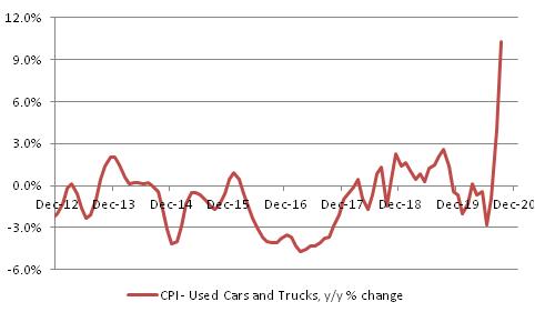
Although we are somewhat conditioned to think of inflation as a smooth process, with all prices sort of rising/accelerating as one, that’s not how inflation happens. Thinking about the process this way – as a rising tide that gradually increases the price of everything – means that we have a predisposition to look at each individual price change and see if we can identify the “reason” for the price change; if we can find one, then that must not be inflation but rather a one-off event. Used cars CPI is a great case study: over the last few months, the CPI for Used Cars and Trucks has spiked and is now rising at about 10% y/y (see chart, source BLS).
Is that inflation? Well, to some observers it is just a one-off effect. For example, an argument by Twitter user @thestalwart in response to this spike in prices was:

Now, this ‘assumes a can opener’ because there hasn’t yet been a sudden and widespread move to the suburbs; moreover, to the extent that commuting is way down shouldn’t that mean a bigger supply of used autos? What about the car rental fleet shrinkage with business and leisure travel way down? Rental is a large source of used cars. Nonetheless, it is surely true that in each market where inflation (or disinflation) happens, you can point to movements of supply and demand in nominal space…that’s just Econ 101. In other words, there is always an explanation to be had beyond “everyone just raised prices because there’s inflation.” And inflation doesn’t happen in a uniform way. I like to say that it is like microwave popcorn: not all kernels pop at the same time, but eventually the bag is full. For each kernel, you can look at local conditions that determined exactly when that kernel will pop (“this one was moister than others, so that’s why it popped”). But the overall cause is “heat.”
So waiting until that time when you have prices rising for no apparent reason is just waiting for Godot. There’s always an excuse.
Recently, there has been evidence that the “heat” is rising. Anecdotally, the Wall Street Journal had a story a few days ago entitled “Why You Might Have Trouble Getting the Refrigerator, Can of Paint or Car You Want,” with the subtitle “Factories rush to keep up as Americans spend on their houses and vehicles.” Again, the story is that there are various bottlenecks on the supply side but the simple explanation is that there’s a lot of people trying to buy and not enough goods to sell. That’s actually the classic definition of inflation: “too much money chasing too few goods.”
Anecdotes are fun, but let’s try to look at this a little more analytically. Enduring Investments has developed an inflation diffusion index, derived from BLS data, which gives a different look at the breadth of inflation. It doesn’t take a weighted average, like Core CPI, and it doesn’t take the midpoint of the consumption basket like Median CPI. Instead, it looks at the number of categories that are seeing prices increasing faster or slower than 2%, weighted equally in their category and with each of the eight major categories getting 1/8th of the overall weight. As a price index, this is absurd – why would you weight Owner’s Equivalent Rent only slightly more than Full Service Meals and Snacks when consumers spend vastly more on shelter? But as an indicator of breadth, it makes some sense: there are, after all, a lot more different sorts of goods that fall under the category “Full Service Meals and Snacks,” and we make purchase decisions in that category more frequently than we make decisions on rents as well. So, in terms of the proportion of decisions made that are seeing higher price acceleration, arguably the index for meals and snacks should be higher. (There is nothing magic here, just an attempt to get a better view of inflation breadth. There are other ways to look at the same thing).
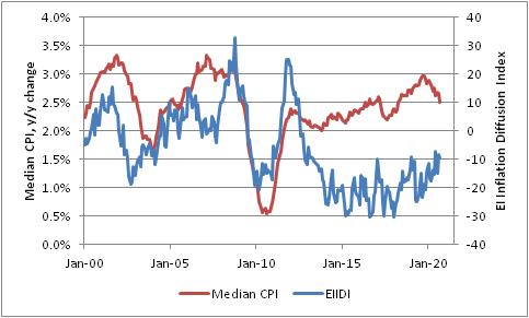
Over time, as the chart shows, the Enduring Investments Inflation Diffusion Index tends to move with median inflation. But interestingly, in the post-Global Financial Crisis period these two have diverged, with the diffusion index in negative territory more normally associated historically with crisis or recession periods. This helps explain why there has been little investor interest in buying inflation protection even though the Median CPI has been rising fairly steadily for seven years! But that may be changing: the EIIDI has been in the single digits negative for three of the past four months, and the 12-month average is the highest it has been since the end of 2013.
For a while, the story of inflation in the US has been that shelter inflation was strong, some other services were seeing some inflation, but the vast majority of goods were seeing stable to declining prices. This is changing. Shelter has been softening – although as I noted last week I don’t think that will continue – but we are seeing pressures percolate more widely. The corns are starting to pop more frequently. Keep an eye on that bag!


