
Active Portfolio Management Using Dividend Growth Stocks: The Role Of Technical Analysis
This guest contribution series is by Trond K. Odegaard, MBA; CEO at VikingDividendIncome LLC.
We begin this installment with a brief word about fundamental analysis. Fundamental analysis plays a crucial role in two ways.
Firstly, it is used to screen for and rank stocks that are expected to pay dividends with no cuts. There’s never a guarantee, but one does what one can to establish high confidence. Going back to our horse analogy from Part 1 of this series, this aspect of fundamental analysis helps us fill up the stable with good strong horses.
Secondly, fundamental analysis identifies (and quantifies) those stocks that are likely to be undervalued from a long-term perspective – 5 years or so. This is a first step in identifying horses that are rested and ready to ride.
We determine the fair value Price/Cash Flow multiple of an individual stock considering its history and its competitors, with adjustment as seems appropriate based on considerations of future prospects. Then, we project the cash flow (per share) expected out to year five, again considering its history and making adjustments as appropriate. Multiplying these two factors together gives an estimate for the price of the stock, 5 years out. There are more sophisticated (and complicated) ways to estimate future value (e.g., discounted cash flow), but this method works pretty well as a rough guide. Once we’ve done all this, and presuming the stock’s dividend looks safe and it has a meaningful positive expected price return, what’s next? Technical analysis.
The Role of Technical Analysis
Technical analysis is used to assess whether a stock is cheap or rich. It’s the second step in determining whether the horse is rested and ready to ride. It’s rather like checking that the saddle is tightly cinched and the bit is securely in the horse’s mouth. You want to do both before you hop on for a ride.
Now, the first essential of active management, where it begins, is getting a good entry point. Getting a good entry is certainly important in a buy-and-hold portfolio, but it’s crucial to active management.
There are a number of ways to do technical analysis. Some analysts use the Elliot Wave approach, others look for patterns in the candles (e.g., head and shoulders, bull pennant). Each method can add value when used by an experienced practitioner. Elliot Wave has the disadvantage that it’s complicated to do and requires considerable effort to maintain. Chart patterns have the disadvantage that there’s no quantitative component to the analysis – it’s entirely visual.
Having said this, I am very mindful of resistance and support levels, and of stocks trading in channels. These are obvious ‘patterns’ even to the untrained eye, that can be very meaningful indicators. FinViz provides charts on individual stocks, with their take on the trading pattern a given stock is in, and their free website is quite good.
We will explore here a middle ground approach involving technical indicators. These are algorithms that manipulate either the price data, the volume data, or both together. Through this mathematical manipulation, insight as to likely stock behavior is sought.
Technical indicators fall into three categories: trend, momentum, and volume. Hundreds of indicators (including variations on indicators) are available, though there are only a dozen or so major indicators that seem to come up all the time in discussions on this topic. We will not attempt a survey of the field here, but rather focus on the one that I primarily use – MACD – after much experimenting with many of the others.
MACD stands for moving average convergence-divergence. Through its very clever construction, it shows both trend and momentum. It is a visually intuitive indicator that has been most helpful in assessing trend reversals – and that’s what you need to determine a good entry point, to buy something cheap.
In a nutshell, the MACD line is the difference between two EMAs (exponential moving average), usually selected to have periods of 12 and 26. On the weekly time frame, this gives measurement horizons of 3 months and 6 months. I use periods of 10 and 20 to make the MACD just a bit more sensitive – but also subject to more false signals – there’s always a tradeoff. When the MACD line is at the horizontal zero line (or equilibrium line), the two EMAs are crossing one another. When MACD line is below the zero line, the shorter term EMA is below the longer term EMA. And vice versa. When the MACD line is heading up, the short term EMA is either converging on the long term EMA (if below the zero line) or diverging from the long term EMA (if above the zero line). And vice versa. Hence the name.
The steeper the slope of the MACD line the faster the EMAs are converging or diverging (momentum). And vice versa. An idealized example of the MACD is shown below in figure 1. The best way to start getting familiarity with the MACD is to pull it up on a price chart (I use TradingView, a well spent $200/year that you’ll make up in one good trade), and also pull up the two related EMAs. Watch how the shorter term EMA undulates (dances) around the longer term one. Watch what the MACD does, and watch what the price does.
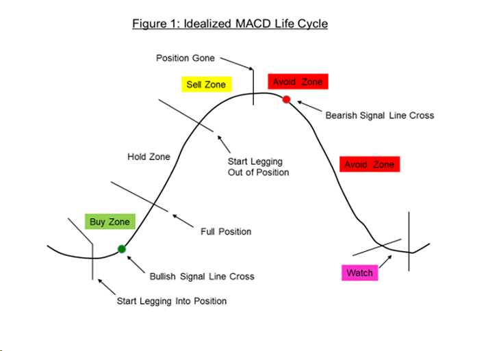
There is also a so-called signal line (or trigger line) usually used with the MACD (not shown in the figure above, to keep it simple). The signal line is a shorter term EMA of the MACD line itself – usually set at 9 periods. So, it’s a smoothed MACD. Many analysts use the signal line as, well, a signal to buy or sell. A trend reversal signal. If the MACD line crosses over the signal line from below, it’s a buy signal. If the MACD line crosses over the signal line from above, that’s a sell signal. In practice, I’ve found that it’s usually better (though a bit riskier) to regard the bottoming or peaking of the MACD line – which occurs before the signal line cross – as the buy or sell signal. When a bottom occurs, the shorter term EMA is beginning to turn up relative to the longer term EMA – they both may still be going down. By the time the MACD line crosses the signal line, the fireworks are usually well underway. In my trading system, the color of the MACD line changes from red to green when the buy signal is obtained (and vice versa).
MACD is a thus a very visually intuitive display of trend reversals. In addition to the steepness of the slope of the line, most systems also explicitly display momentum – measured as the difference between the MACD line and the signal line and shown as a histogram. In my trade system these bars are multi-colored to make the display of momentum changes even more visual. The bars are highest when the two lines are moving away from each other, indicating momentum is increasing. When momentum slows, the bars peak – then level off – just ahead of the bottoming or peaking of the MACD line itself. In my system, the cyan bars turn purple at the peak, and a couple of purple bars is a strong warning that momentum has slowed or stopped, and the trend may reverse. At the bottom, the bars turn from red to brown as the stock enters the buy zone. There are other ways to use the MACD, and the interested reader is encouraged to survey the many web articles and YouTube videos on this topic and to experiment.
A few more thoughts on using the MACD. The longer time frames of daily and weekly tend to be relatively more reliable than shorter time frames. That’s why it works well for dividend growth stocks and not so well for options (where the action usually unfolds on a shorter time frame). The weekly timeframe is a measure of a good long-term trend – you generally prefer to swim with the current in the stream. But at any timeframe, MACD is a lagging indicator – not a leading indicator. Prices drive the MACD, not vice versa.
In the real world, of course, the daily and weekly cycles are sub-cycles of a longer monthly cycle – which takes 1 to 3 years to unfold. In practice, I tend not to use the monthly MACD. For longer term assessment, I look to the fundamental analysis. Also, cycles are not generally as clear as these idealized ones. Real cycles can be shallow and a trend reversal difficult to discern, and they can be discontinuous – smoothly proceeding, then suddenly a jog up or down. Recall, price movements drive the MACD, not vice versa. MACD is a lagging indicator. So, reality is often complicated and messy, and subject to considerable judgement error.
Determining a suitable time to enter a stock, to avoid a disappointing early downdraft for either a buy-and-hold or active portfolio, is probably the most challenging part of investing. But we have to make this judgement somehow, we can’t avoid it. I take comfort, in my personal portfolio, from the knowledge that even if I miss on the entry (despite all the effort I go to), I’ve still got high confidence that I’m in a stock that will fulfill its primary mission – paying me stable dividends come hell or high water. And since it is fundamentally undervalued, over a long horizon it should appreciate in price.
In the next and last installment of this three-part series, we’ll discuss taking gains and how to determine a suitable exit level for actively traded portfolios in particular. This is the fun and exciting part of investing – extracting gain from Mr. Market for redeployment into new opportunities. We’ll examine some real examples from my stable, and identify simple rules for picking a good exit point.
Disclaimer: Sure Dividend is published as an information service. It includes opinions as to buying, selling and holding various stocks and other securities. However, the publishers of Sure ...
more

