
Charts That Matter - Wednesday, Nov. 28
Going Going Gone
The graph on Lodha developers (largest in India) debt pricing which shows acute concerns on the financial health of the company. (Yield at 24%). If the largest player in the market gets into the discount pricing model – this could imply a fall in asset prices across Mumbai (largest real estate market in India) impacting other leading players in the region.
(Click on image to enlarge)

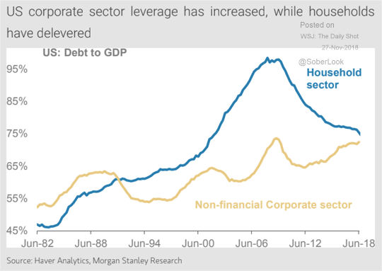
While the US:
First Buyback, then restructure, then default.
Households have deleveraged since the financial crisis, corporations have piled on more debt.
The dollar is my currency but it is your problem
Raoul Pal’s Dollar chart…. This is THE chart that counts… Fed Broad Dollar Trade Weighted Index. 130 and there will be a confirmed large cup and handle formation.
(Click on image to enlarge)

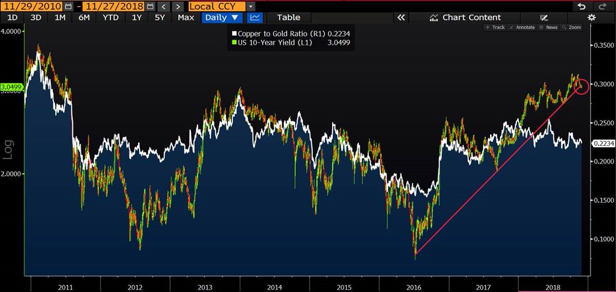
This is my favorite trade at the moment:
Copper to gold ratio provides a strong indication of where yields should be, and their recent divergence suggests further upside for USTs. Yield curve inversion could quickly become the Fed’s next problem.
(Click on image to enlarge)
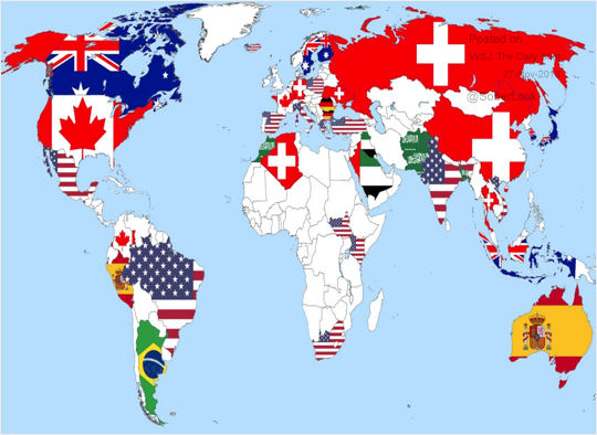
Look at the love Indians have for their former colonial master and USA.
“Which country would you like to live in (besides your own)?”

Comments
 No Thumbs up yet!

